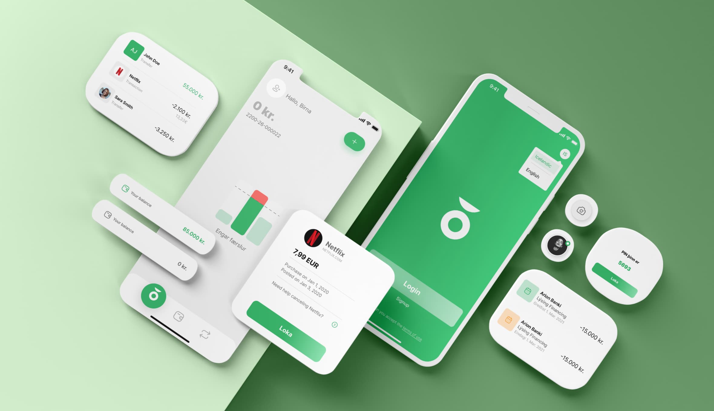
indó Bank
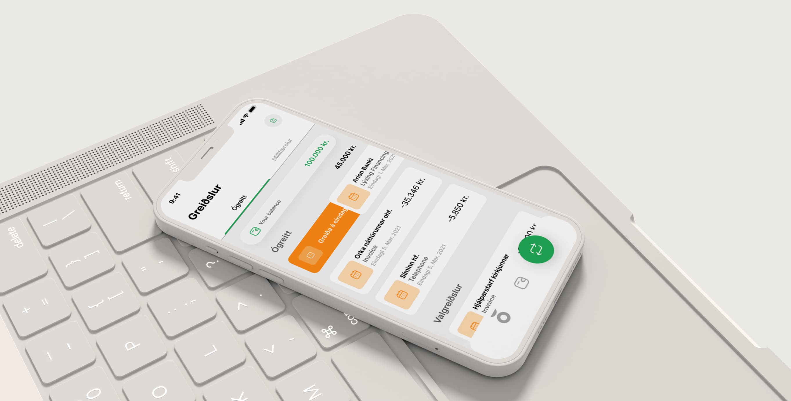
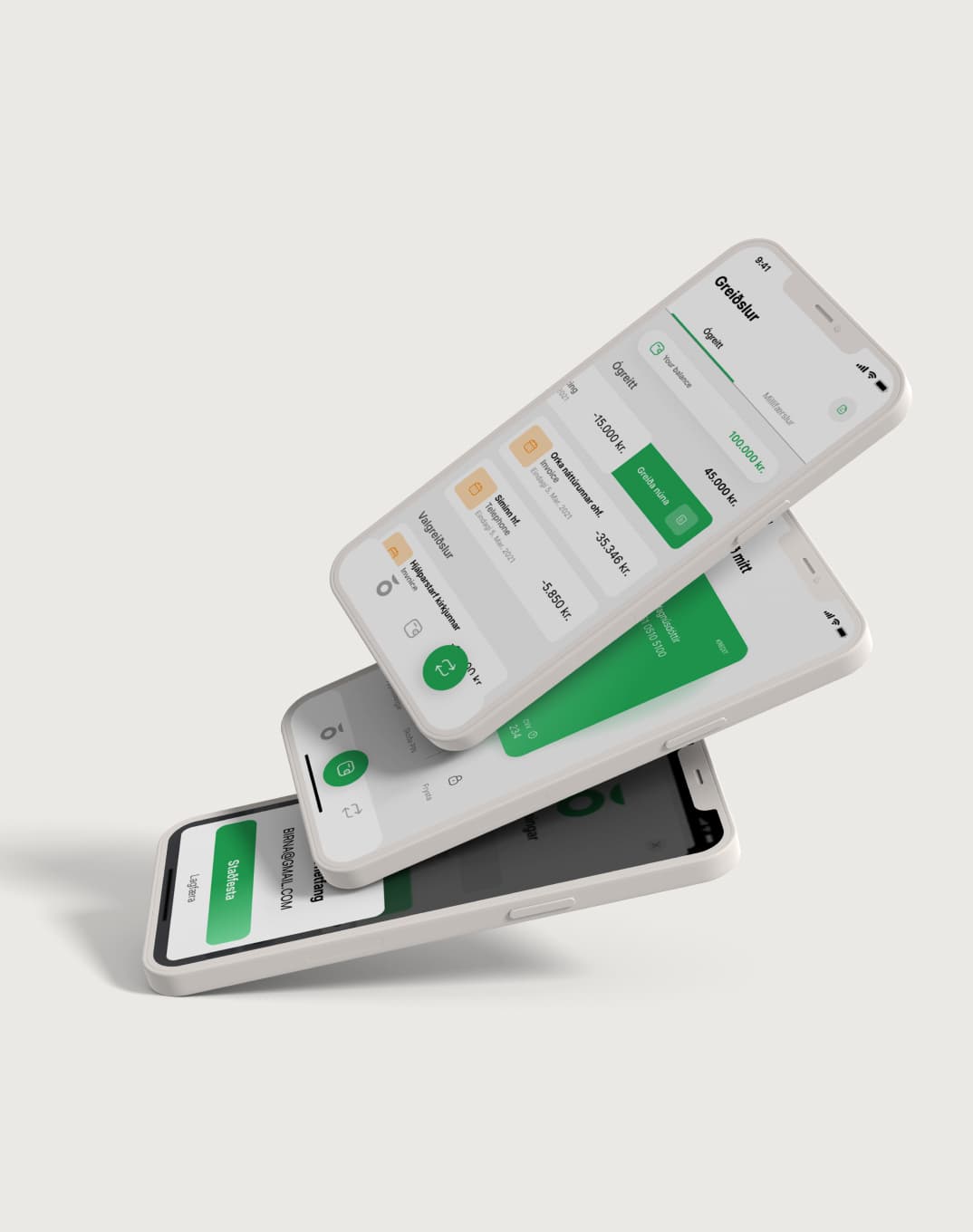
indó app is a cutting-edge solution to manage all the daily expenses and transactions very easily, all in one place, with no time. Easy to use, safe and transparent, the users feels always at the center of the entire user experience.
The core principles. Simple design Easy to use
The user experience design in the mobile app was designed with a modern style and user friendly approach. We placed the users needs first on the forefront of this strategy, so that any person, regardless of age, would be able to use the full functionality easily.
Expertise
- Discovery
- Definition
- Ideation
- Prototyping
- Testing
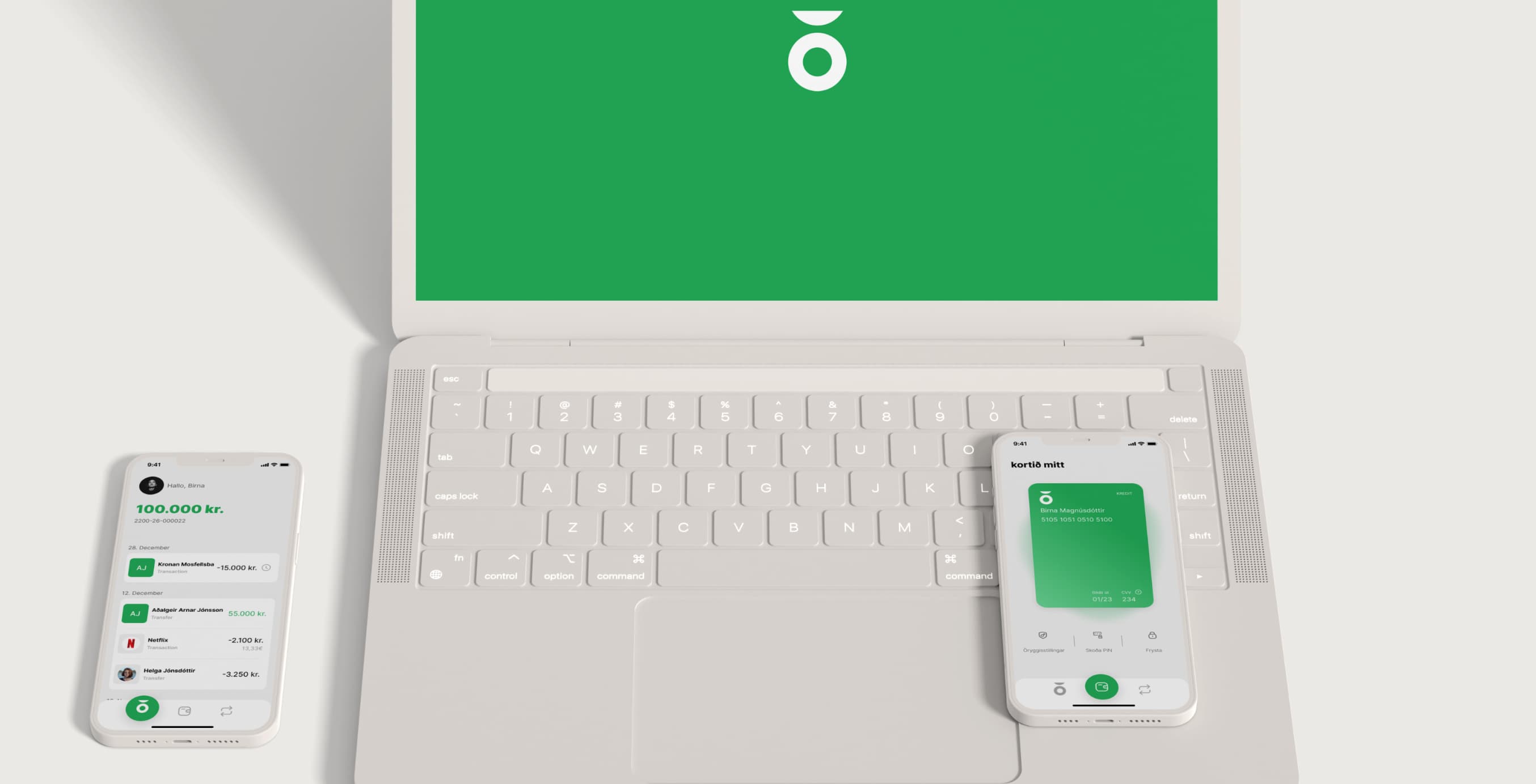
Platforms
- IOS/Android App
Completed
- Ongoing
Content
Discovery
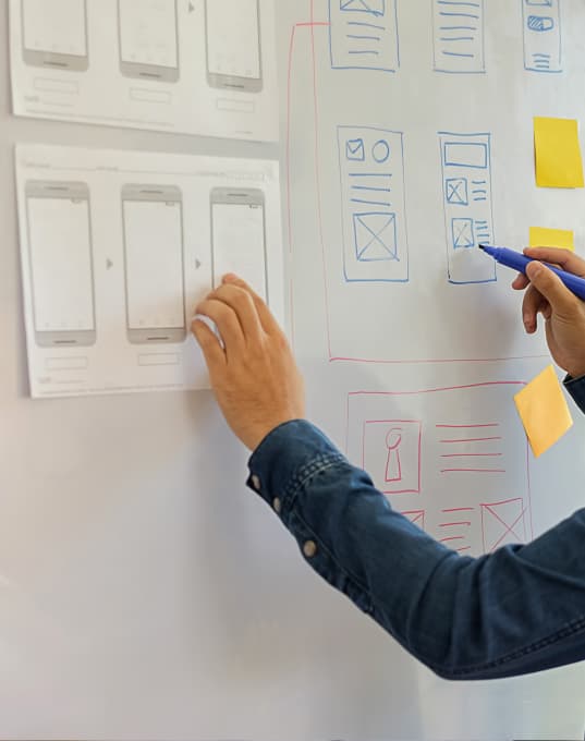
The Design Thinking methodology we used for this proposal was highly focused on using a human-centric approach. It allowed us to tackle defined and complex user problems and provide creative and effective solutions.
Our product discovery workshops
For this proposal we have conducted an iterative process that consists of 5 phases: discovery, definition, ideation, prototyping and testing. The discovery phase is always one of the most important part of the entire project. With brainstorming sessions and insights analysis from user research and competitive analysis, we found out the users needs and preferences, how they think and feel. We thought that to attract different groups of users, we’re supposed to address user issues while providing a seamless user experience. After collecting all these details and analysing project specifications, we prioritise features and created a dynamic prototype.
Strategy
After we gathered all the information from the discovery research we organised all the answers and sort the concerns into groups to grasp and define better the problems. We focused on features related to solving some of the major desired outcomes found in the experience map and online research. We designed an app simple and easy to understand where the users feel encouraged to build financial habits.
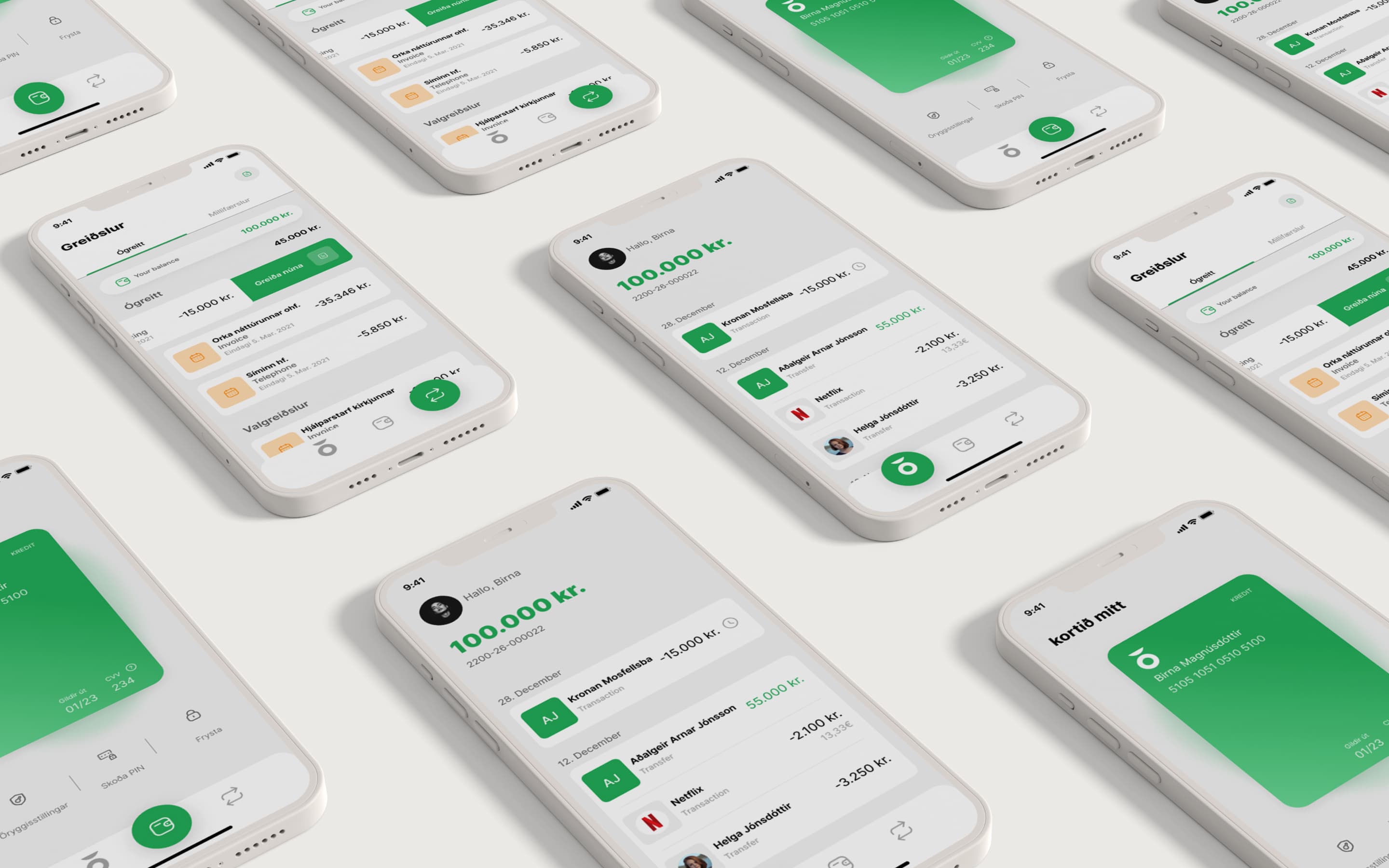

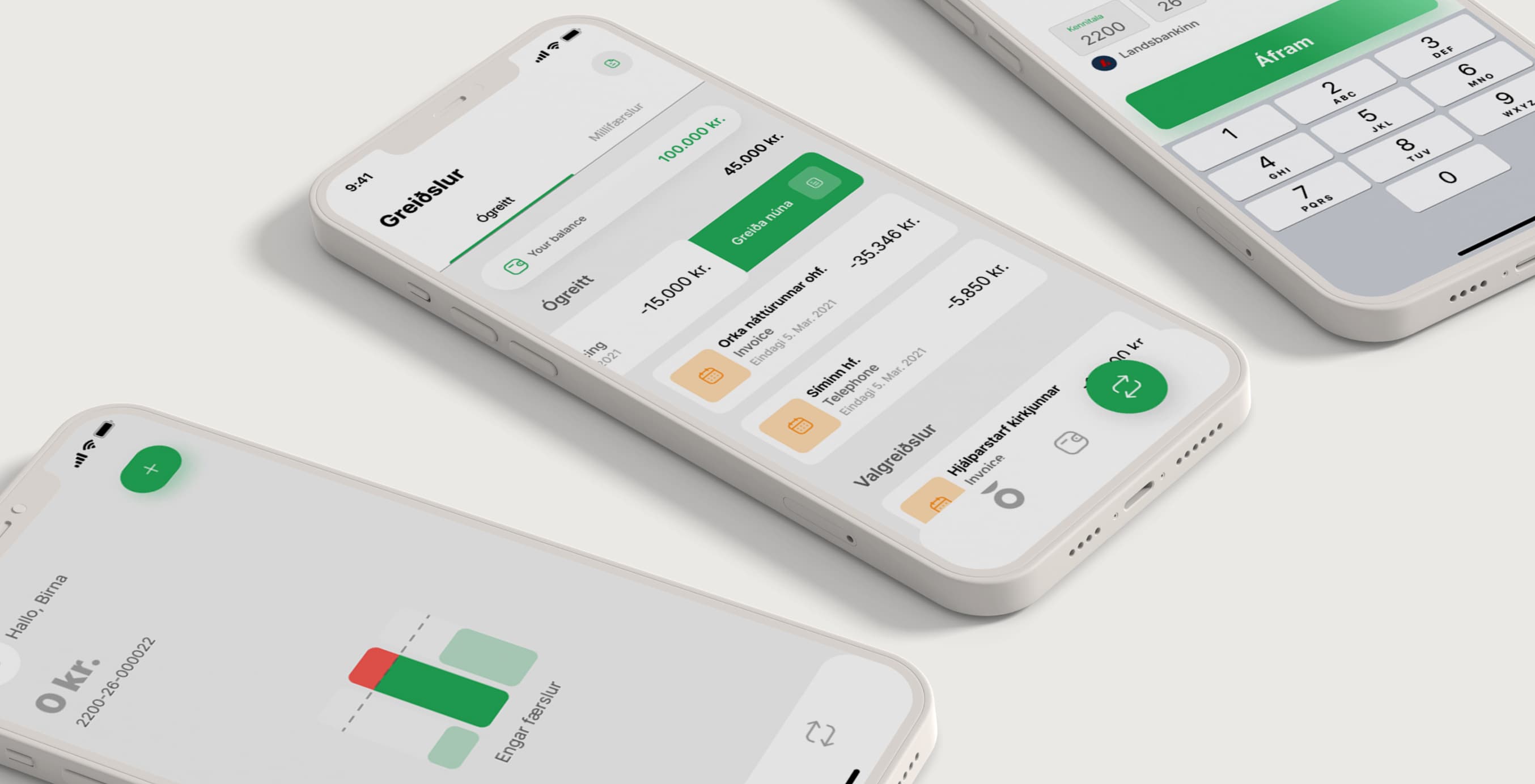
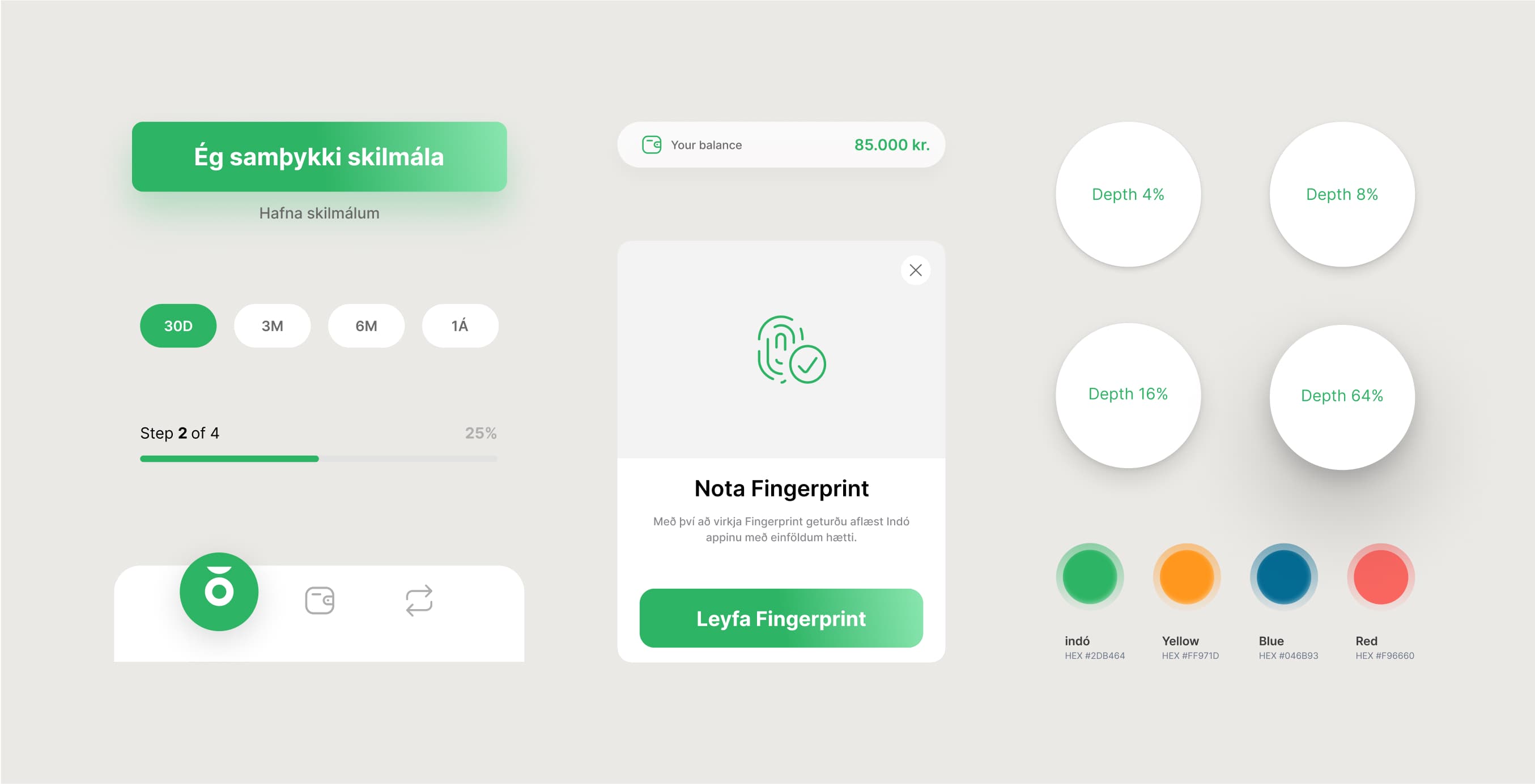
Fintech apps don’t have to be boring. But most of the time aren’t the most exciting products to use. They feel cold, boring and corporate. During the competitive analysis in the Fintech industry, we clearly saw that most of the apps had bland colour palettes and uninviting user experiences. Often this approach, alongside being bombarded with information, can be overwhelming, which makes most users leave. Instead we decided to use a design direction strategy with a minimalistic design and bride colours in combination with a content strategy concept solution where the information and the cognitive load required were structured in a more simple way.
View projectStrength in simplicity
The creative direction we used for indó proposal uses a playful and personable approach. We used an interface that is straight-forward and mature, but at the same time that includes an easy-going and simple use. Tipically, when someone thinks of money and finances, the typical vision is pointing at graphs and charts. So we decided to balance this with a more inviting and calming atmosphere user experience. By using this direction we enabled a more motivating healthy financial experience.


UI Design
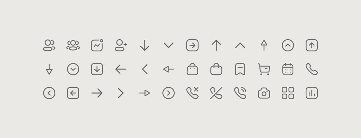
The overall redesign proposal improved several aspects of the entire user experience. We improved the user experience by removing known pain points in the user journey and achieved to make a financial app more fun and engaging. Below you can see and example of the playful icon set we used for this project.
The results
The final results of this project were very satisfying. We kept the app friendly, fun and inviting, by using a flat UI design and incorporate round shapes across the entire design. At the same time, with this direction and visual language selected, we managed to have a clear understanding of the finances and an easy-to-use interface. We also included a new playful colour palette with a new primary green colour and a variety of bright secondary palette. We've made sure to maintain an ample amount of white space in order to keep the app clean and modern, and to convey that sense of trust, we decided to have all the main CTA's buttons in the main primary green colour. The same visual design strategy was applied for the iconography across the entire app. Therefore we used a lined set of icons so the app would appears more modern and sleek while still giving off a cheerful vibe. It was a great pleasure being able to work on this project and been able to collaborate with the awesome team of people at indó.