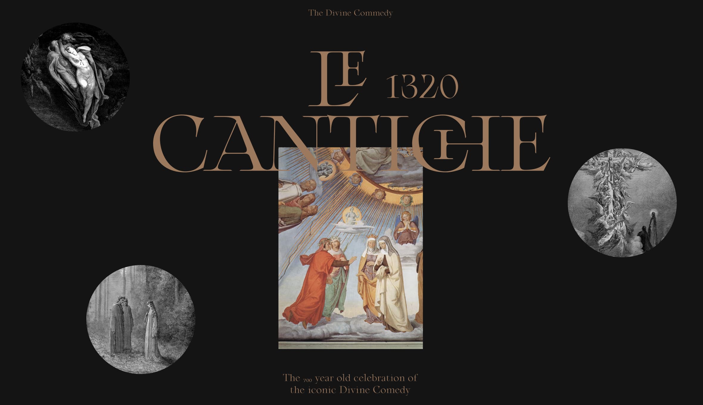
Le Cantiche 1320
Le Cantiche 1320 is a project created to celebrate the 700 years anniversary of the iconic Divine Comedy. The italian narrative poem written by Dante Alighieri in 1320.
The history of literature made digital
The core of the website was to display in a compact view the entire concept idea of the book literature and make it made digital. We decided to use a storytelling mechanism with a timeline. The idea was to create a mix of text and illustrations artwork, dividend into chapters, where we could provide the user with a feeling expirence of going through the book.
Expertise
- Discovery
- Ideation
- Web Design
- Development
Platforms
- Web Desktop
Completed
- 2020
Content
Discovery
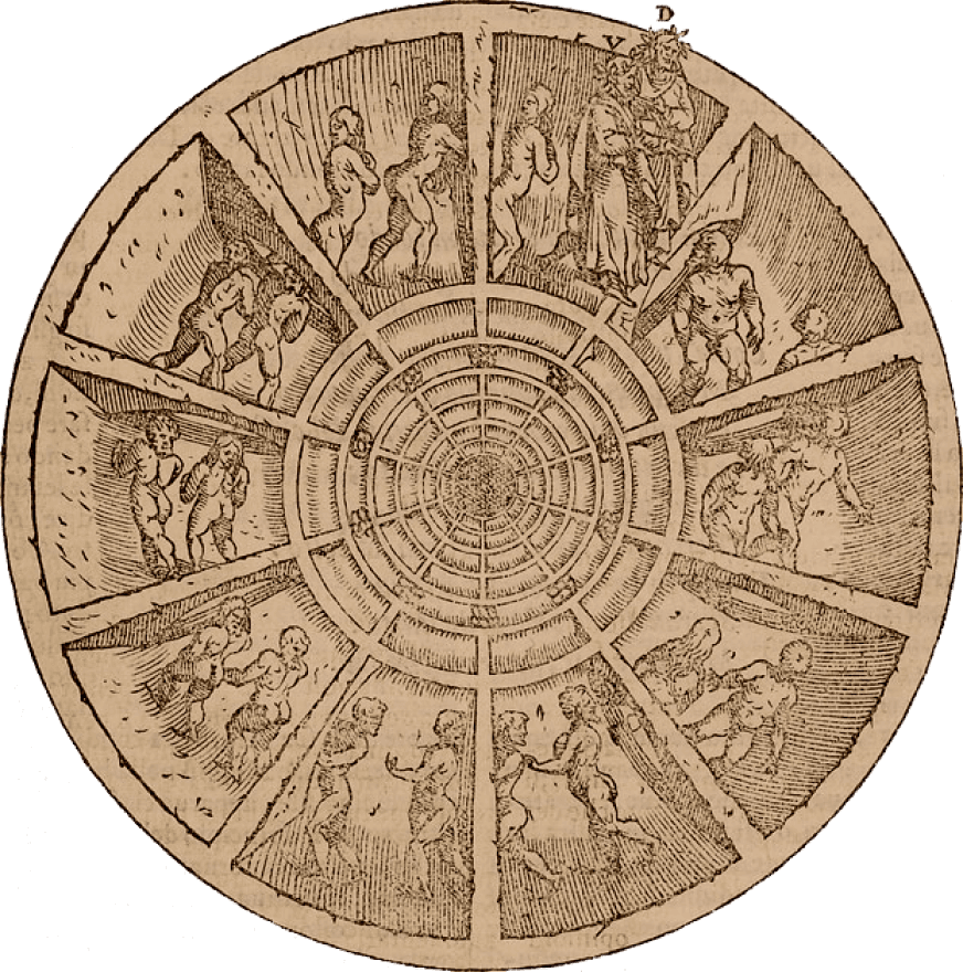
A huge part of the design process was spent on research. Collecting all the important information, gathering all the right content that needed to be displayed and sourcing all the related images, gave us the ground foundation to build the initial design concept.
Turning interactions smoothly and efficiently
In parallel to the research, we created a copy/paste storyboard with all details of the project to better visualise all the elements involved, and to start to create a design structure. With this in mind we started different design explorations for the page layouts and structure. The storyboard was so important and made the design work much easier. The whole design was built in separate/independent blocks, allowing them to be moved across the whole design if needed. The main idea of this project was to reproduce a digital booklet where users could browse easily without losing the look and feel of a book. We thought that having a combination of large images and big and bold typography in a storytelling layout would help people to get more engaged. We decided to have the design as a double page spread like an open book, so we choose to have a horizontal scrolling experience.
Strategy
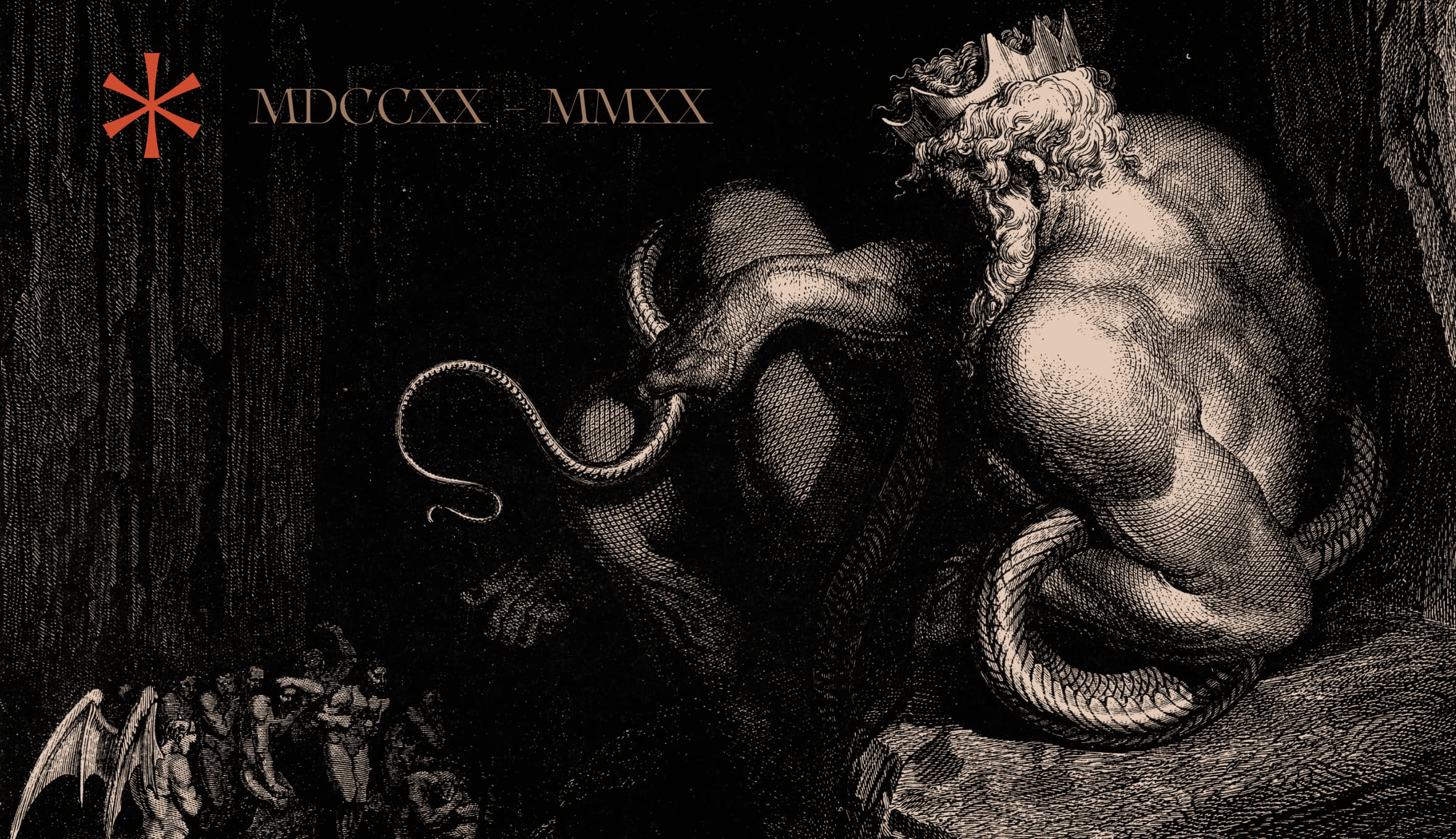
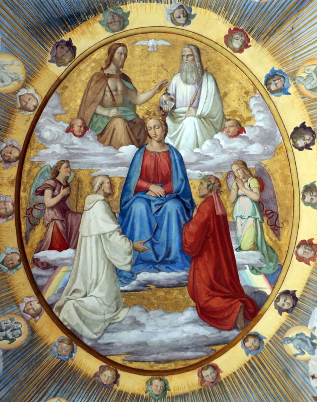
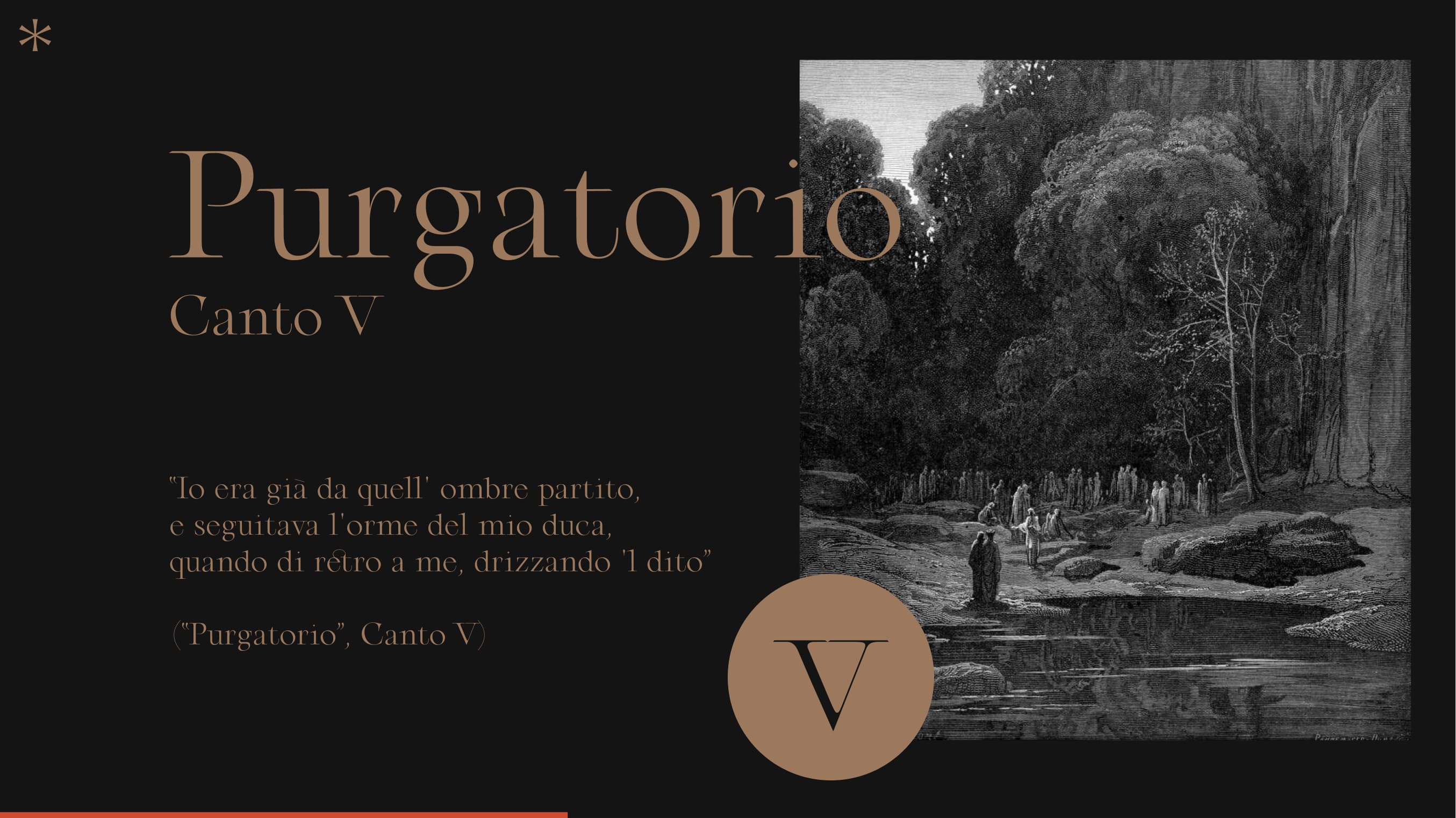
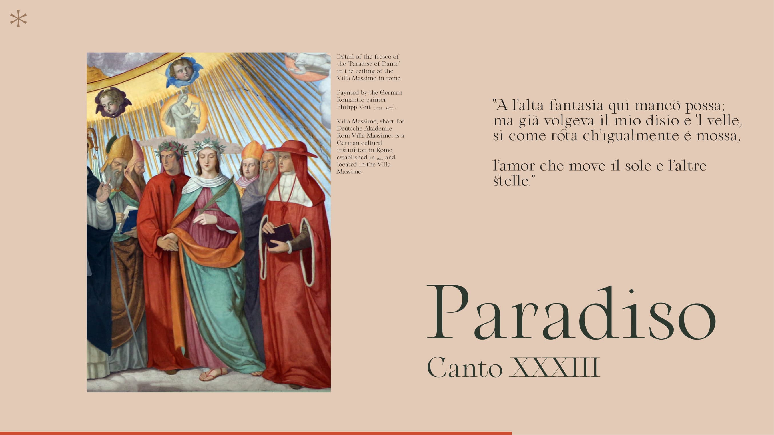
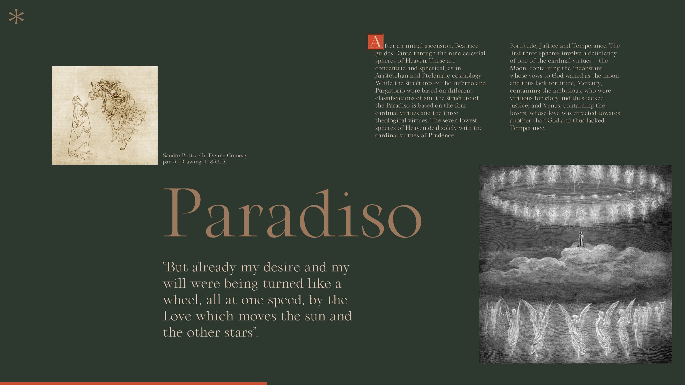
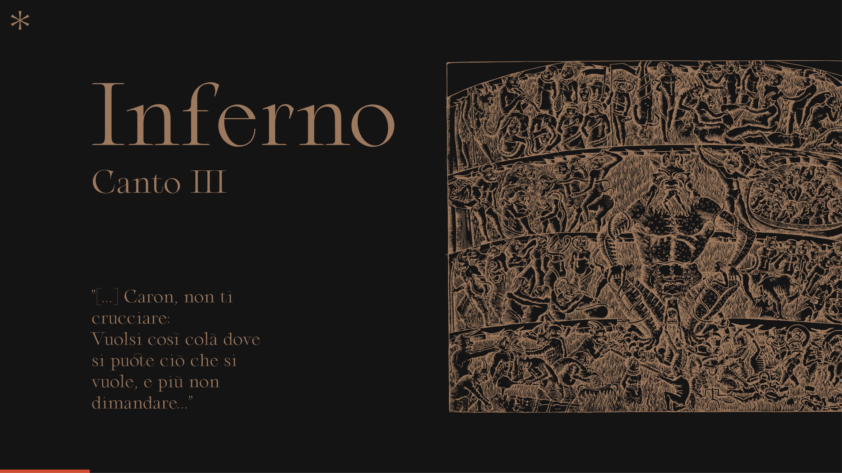
The layout is divided into four main sections where we focus on each book of the poem. The Hell, the Purgatory and the Paradise. An introduction page was created to introduce the project and the overall details of the three books. A particular effort has been made on the design in order to highlight all the illustrations and images. To follow this path we tried to give full height to most images.
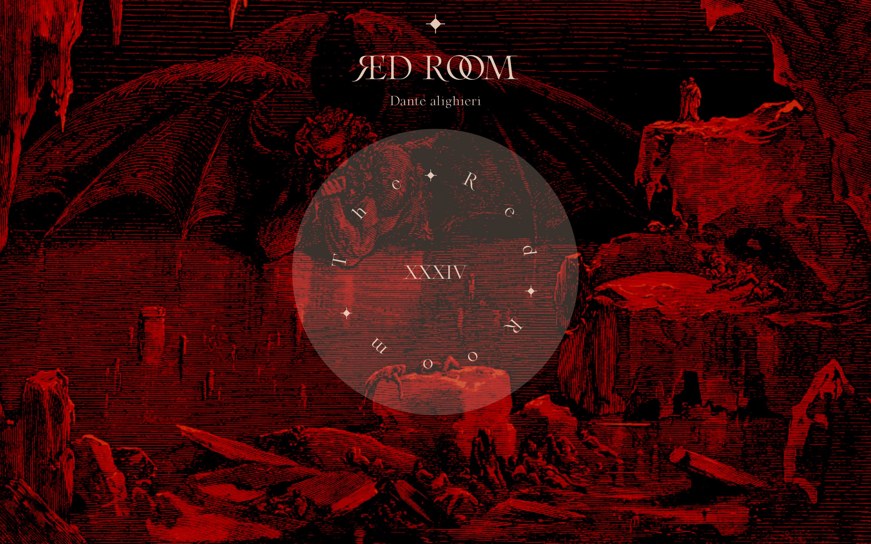
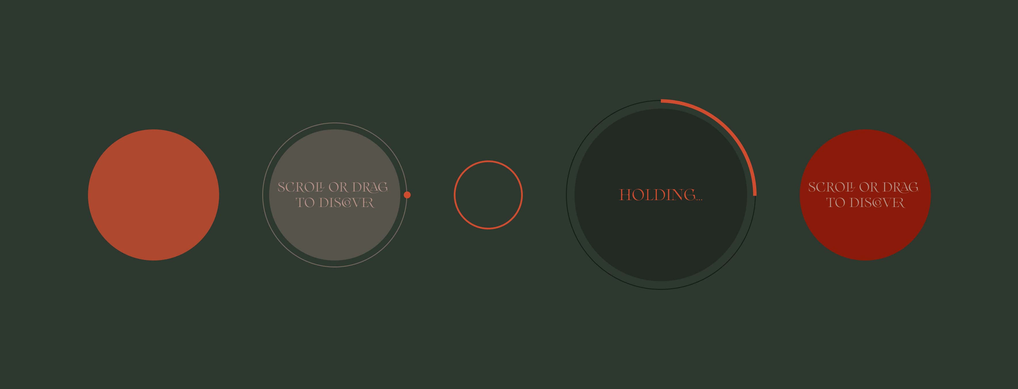
The main idea was to adapt the book reading feeling to a web experience, so we created several nice effects from it. First, we decided to use viewport height as the main unit in the CSS in order to keep the same layout whatever your viewport dimensions. Then, we played around horizontal smooth scroll parallax on images to add some volume to the reading. Next, to lead the user reading, we created a text block fade using CSS ‘mask-image’ property and ‘linear-gradient’ function. Finally, using WebGL and Fractal Brownian Noise we did a dissolve effect to imitate paper burning-feeling. Also, for performance reasons all images were rendered with WebGL.
View projectXVIIIth Century French aesthetics
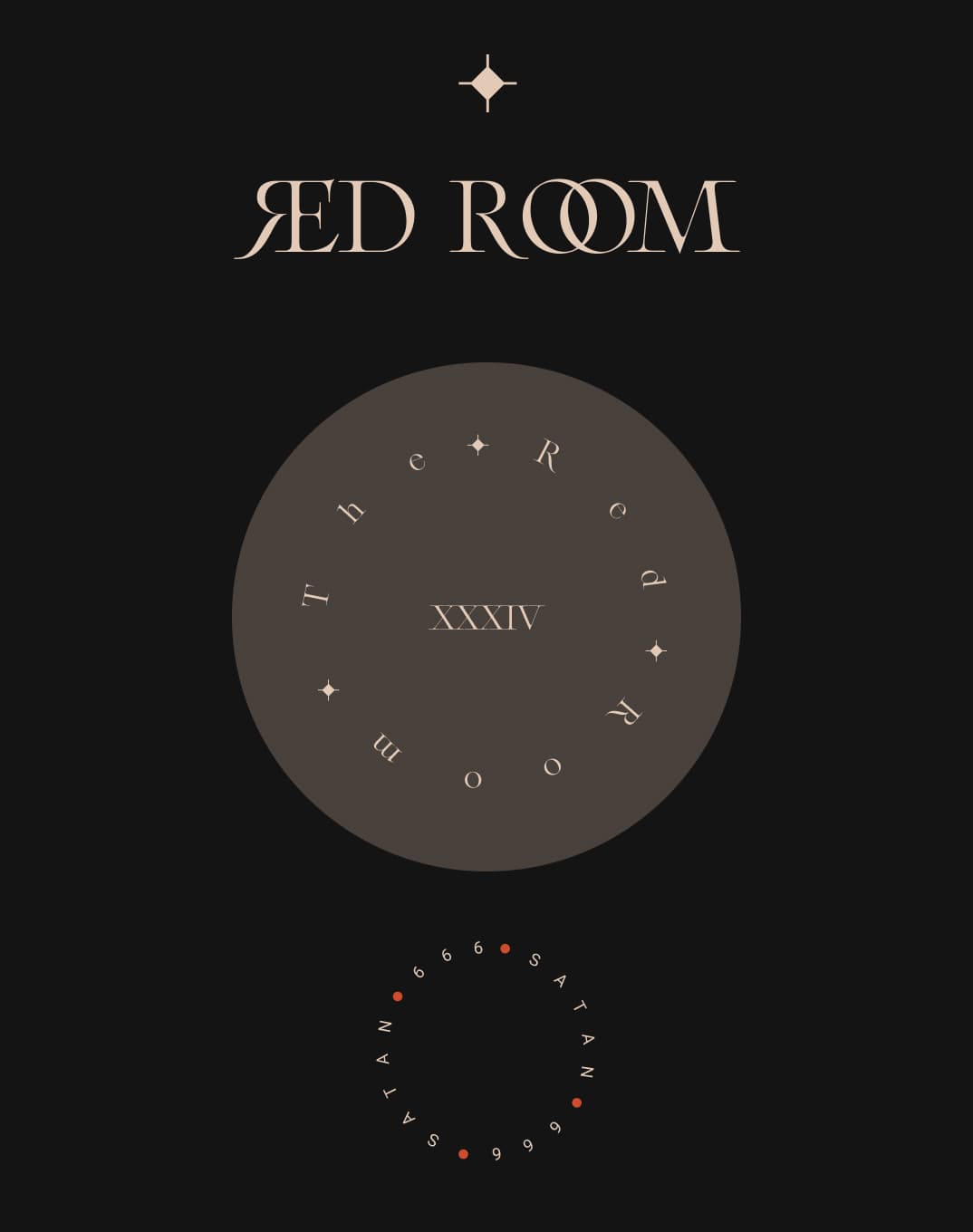
Particular attention was given to the typography in use. In this project we made a lot of room for typography, where this desgin direction defined drastically the look and feel of the whole experience. In fact 90% of the design was made with typography. We wanted to highlight somehow the old century style. So we decided to use a meticulous and generous serif family typeface based on XVIIIth Century French aesthetics, in order to create this atmosphere. A lot of time and research has been spent finding the right style, and in the end we decided to use the font “Arthemys Display" designed by Morgane Vantorre, a French type designer.


Visual Design
It was essential to mix the design whit micro-interaction rich in visual details, so the entire experience would feel more engaging. We spent a good amount of time polishing all the details and we have given particular emphasis to the design of the cursor and its interaction with the environment.
Final thoughts
The font used, Arthemys Display, as we mentioned earlier, was taking a big part into the entire experience. Its design was inspired by old engraved letters from cartographies, and represents a bringing together of shapes from the past with a contemporary twist. The graphic particularities of Arthemys (especially its ligatures and alternates) enable any text to have both a delicate and majestic value. Adding a scroll horizontally with a timeline was a big oppotunity to visually impact the user. We wanted to create the feeling of leaf through a book but also a second wow effect to keep the users scrolling and exploring the site. One of the biggest challenge was to create a scrolling effect to make it work with the entire design. Moreover we spent a large amount of time optimizing all assets, and animations, performances issues, compatibility, etc. In the end we achieved to have the whole experience feel really smooth.